
Accessible Redesign

LDN Learning Disability Network London
Role: Freelance UX Designer
Sector: Social Care Provider
Challenge: Website Accessibility Audit and Redesign
Timeline: 1 month
SKILLS + EXPERIENCE
-
Google Analytics
-
Accessibility audit and AXE plugin
-
Usability research and heuristic analysis
-
Information architecture
-
Business and stakeholder support
Context
Brief:
Audit and modernise a 10-year-old website to make it accessible, mobile-first, and user-friendly.
Issue: The LDN website was originally designed with accessibility in mind specifically for adult SEN users with the Browse Aloud tool, but over the years:
-
Text size, contrast and link issues developed.
-
Confusing info and dense content
-
Missing links and poor navigation
-
Non-responsive mobile header/menu - 60% users mobile.
Goal: Deliver clear audit and recommendations for an accessible, mobile-first redesign, keeping LDN’s branding.

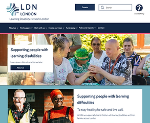
Current view

Role and Responsibilities
-
Conducted full accessibility audit
-
Produced personas and analytics insights
-
Tackled mobile header, menu responsiveness, taxonomy and Information Architecture
-
Proposed design aligned with existing brand
-
Delivered responsive Figma designs + presented to CEO anddirectors
Research and Insights
-
Accessibility audit: Contrast failures, small text, missing links, confusing Information Architecture.
-
Personas: SEN adults, support workers, parents, councils, donors
-
Benchmarking: Compared with Mencap and other providers
-
Analytics:
-
60% of traffic mobile → mobile-first critical
-
Poor SEO from accessibility failures
-
-
Insight: Accessibility standards evolve; sites must be reviewed regularly


Design Solutions
-
Mobile-first responsive header & menu
-
Improved menu taxonomy and Information Architecture.
-
Simplified service pages and cards
-
High-contrast typography and accessible CTAs
-
3 style options created for CEO presentation

Before and After
Menu Issues and Solutions

-
Contrast failures with overlays
-
Missing entry points
-
Duplicate items
-
Search is too close to menu in mobile


Redesigned Menu

-
Realigned Taxonomy
-
Added in missing links
-
Hi contrast font 20px
-
Improved keyboard accessibility focus

Header Issues and Solutions
Redesigned Header
Contrast issue


-
Duplicated search
-
Poor tap accuracy
-
Mobile header height to tall
-
Unfamiliar patterns
-
Contrast and font failures
-
Missing icon labels
-
Outdated accessibility statement that should be in footer


-
Larger fonts
-
High contrast AAA
-
Mixed upper/lowercase CTAs
-
Labelled icons
-
WCAG-compliant mobile header
-
Removed accessibility statement
Menu Issues and Solutions
-
Contrast failures with overlays
-
Missing entry points
-
Duplicate items
-
Search is too close to menu in mobile
Redesigned Menu
-
Realigned Taxonomy
-
Added in missing links
-
Hi contrast font 20px
-
Improved keyboard accessibility focus
Information Architecture Services
Outdated filters, duplicated services and unclear heirarchy.


Redesigned Services
Redesigned cards with clear hierarchy (service name, subheader for age/location), grouped by age → easy maintenance


News Section
Issues: unclear carousel with poor contrast and wasted space

.png)
Redesigned News
Solutions: 3 large accessible story cards, easy read font, CTA buttons.The Mencap website is widely recognised as a leader in accessible design for SEN users. Its large typography, Easy Read features, and simplified news cards set a standard for accessibility. I applied this learning to LDN redesign.


Fundraising and Donations
Issues: donate button missing on mobile, scattered CTAs with poor contrast
%20copy.png)
%20copy.png)
Redesigned Fundraising
Solutions: added donate button to header, redesigned CTAs and 4 fundraising cards for the homepage


Global Footer
Issues: Outdated links and structure, small social link icons, duplicated CTA's
Redesigned Footer
Solutions: Improved structure, clearer and relevant CTA's, social link icons on mobile are 48px for tap accuracy
.png)

UI Options and Design System Touchpoint
-
Presented 3 style directions (keeping branding)
-
Redesigned buttons and cards with accessibility in mind
-
Started a basic design system: buttons, cards, typography, tested tokenisation.

Simple UI

Curved corners
Colourful
Buttons & Colour Balance
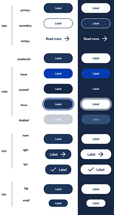
The CEO wanted to retain strong brand colours across the site. To keep the design balanced, I used navy and white as primary backgrounds, with pink and aqua applied as section highlights. This required the button system to work in both light and dark modes, ensuring accessibility and consistent contrast whether placed on white or navy backgrounds.

Accessible Buttons & Cards
To support the needs of SEN users, I designed buttons and cards with a clear keyboard focus state. This ensures that when users tab through the website, interactive elements are visually highlighted and easy to follow. Since news articles and services are key content areas for LDN’s audience, the focus mode was critical to making navigation truly accessible and inclusive for all users.
Final Design and Learnings
Outcome: LDN gained clarity on accessibility gaps and new designs for a compliant, mobile-first website.
I provided 3 reports to help them understand and choose a new dev partner.
Learnings for me: Importance of translating technical issues for stakeholders (bridging SEN users, business, charity needs).
-
Accessibility is never “done” — it evolves, like “clearing a cupboard” every few years.
-
I enjoy helping organisations and stakeholders navigate what feels like a “minefield” by providing clarity and empathy.