
Entain PLC Net Winnings
Role: Mid level UX Designer | Player Experience Team
Sector: Online Gambling
Challenge: Regulatory adjustment to Deposit Limits
Timeline: 6 weeks
SKILLS + EXPERIENCE
-
Competitor Analysis and Heuristic Evaluation
-
Usability Testing and Synthesising Insights
-
Lean UX Process
-
Predicted Revenue Increase 2.2M
Context
Brief: Regulatory updates allowed for a net winnings deposit limit change in the calculation in the UK.
Users needed clarity on how net winnings affected the overall deposit limit they had set.
Issue: Users needed to clearly understand why their deposit limit calculations changed after withdrawing net winnings.
Existing Situation: Net winnings were displayed as a negative value, confusing users.
Business Impact: Needed to reduce confusion while ensuring compliance and aligning with competitor standard
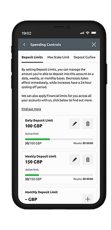

Existing Deposit Limit Screen
Existing Deposit Limit Screen with net winnings withdrawn
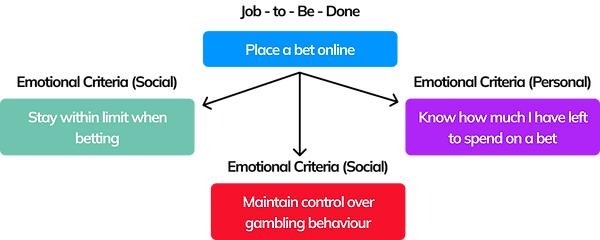
Understanding User Needs and Decision Making Proces
We mapped the decision-making process using Lean UX and Jobs to Be Done (JTBD) to uncover key functional and emotional needs:
-
Functional Goal: Stay within daily deposit limits.
-
Emotional Need: Clarity and confidence in spending.
-
Social Responsibility: Control over gambling behaviour.
Aligning our design with these needs ensured the deposit limit updates were intuitive, transparent, and supportive of responsible gambling.

Project Scope and Challenges
Scope:
Updates to multiple areas, including gambling controls, Safer Gambling microsite, FAQ pages, emails, affordability checks, and promotional banners.
Challenges:
Product & cashier teams wanted minimal changes.
UX had to advocate for user needs and push back against misaligned mental models.
Ensuring all transactional displays were consistent across interfaces.
Need for quick implementation while ensuring transparency.

Login Interceptor

Microsite content

FAQs content

Deposit Limit Page
Research and Insights
Competitor Analysis: Paddy Power, Skybet, Bet Victor and William Hill had clearer deposit limit displays and 2 had implemented the net winnings update already.


Paddy Power
Skybet
Bet Victor
William Hill
User Testing Insights
User Testing:
9/9 users understood the negative signs on Transaction History screens.
2/9 users guessed the minus sign on the Max Loss Limit screen may relate to net winnings, but were uncertain.
7/9 users believed the negative sign indicated a loss on the limits screen.
Findings:
Users misunderstood the negative value format, assuming they had exceeded their limits rather than understanding the updated spending capacity.
Conclusion:
To align with users' mental models, we simplified the display: showing the deposit limit set, remaining limit, and net winnings adjustment separately for clarity.


Transaction History Screen
Max Loss Limit Screen
Stakeholder Alignment & Advocacy
Resistance: Product and Cashier teams had wanted to retain the negative format it made sense for them.
UX Advocacy: Demonstrated user confusion through testing insights and competitor comparisons.
Business Impact Argument: Highlighted potential loss of user trust and compliance risks.
First solution: Product team had agreed to use different data points and remove the negative sign but the pay off was to keep the same interface with a info/tooltip explanation.
Result: Too complex and tooltip icon is fiddly and easily missed.


Different Data Points 1st Solution
The numbers are small and the user
has to work out why the lower limit
is higher than the deposit limit.
Net winnings tool tip explanation is easily missed and fiddly with tap accuracy with
mobile.
Alternative Design Concepts
To show the need for a simpler approach, we explored design alternatives with the product team.
Our goal was to make deposit limits clearer by:
-
Removing the limit bar UI to reduce visual clutter and improve focus on key information.
-
Breaking down limits into larger text, ensuring users could easily understand their set limit, remaining limit, and adjustments from net winnings.
-
Adding a statement on the card showing how net winnings increased the overall limit, ensuring transparency.
-
Truncating text to prevent content from pushing limits below the fold, allowing users to see all daily, weekly, and monthly limits without scrolling.
These changes aimed to simplify the interface, ensuring key information was visible and easy to understand at a glance.

Alternative iterations with Deposit Limits and net
winnings withdrawals.
My Preferred Solution
Before:
The original design displayed net winnings as a negative value, leading to confusion.
The deposit limit bar added visual clutter, and some limits were hidden below the scroll due to long text.
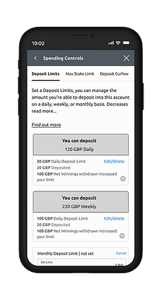
After:
The updated design provides clear breakdowns of set limit, remaining limit, and adjustments. The net winnings are now explicitly stated as increasing the overall limit.
Removing the limit bar and making the cards smaller ensures all limits are visible without scrolling.

Existing Screen for Deposit Limits and
net winnings.

My preferred solution for Deposit
Limits with net winnings.
Impact & Predicted Results
Business Impact: Predicted £2.2M monthly uplift from improved deposit clarity.
User Impact:
Increased understanding of deposit limits.
Reduction in customer support queries related to deposit calculations.
Improved alignment with user mental models.
Team Impact: First time Senior Product Manager, Cashier, and Compliance teams were fully aligned with UX team.

What Others Say
"Working with Frances has been an absolute pleasure. She has an incredible knack for understanding what’s best for the customer and never hesitates to stand her ground when it comes to doing what’s right. Her passion for learning and willingness to take feedback is inspiring and she’s always looking for ways to grow and improve. What really sets her apart is how much thought and care she puts into visualizing user journeys before diving into any project. That extra effort shows in the quality of her work, which consistently delivers a big impact. Her dedication, hard work, and customer-first approach make her an amazing teammate and someone I truly admire."
VAIBHAV JAIN
Senior Product Manager, Safer Gambling, Entain

